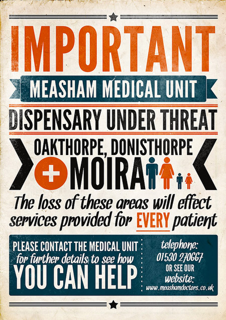
Logo design is a broad medium, full of diverse styles, genres and talents. With advancements in software many logo designs have become increasingly complex, utilizing wide color spectrums, complex gradients and intricate illustrations.
Whilst these logos are visually impressive, they often are not the most effective way to successfully communicate a brand or idea. Often a simpler, more basic logo will serve the company or individual better.
Today we demonstrate the power of a truly simple, sleek approach by presenting a collection of inspiring logo designs. We hope that these logos motivate you to try a ‘back to basics’ approach in your next design and really get to the heart of the brand in question.
[Note: Have you already ordered your copy of our Printed Smashing Book #3? The book is a professional guide on how to redesign websites and it also introduces a whole new mindset for progressive Web design, written by experts for you.]
Simple and Sleek Logo Designs
Angelina by contrast8
A wonderfully elegant logo that transforms the letter ‘A’ into a stylish logo graphic, with visual hints at a flower vase shape.
Valdao by magicshadow
Valdao uses a simplistic representation of a bird of prey to infer the companies qualities (speed, efficiency). The bird’s wings also form into a ‘V’ shape, whilst taking on the look of a stylish car emblem.
National Photography Month by firebrand
A very clever logo that combines the basic images of a camera with the national flag colors for Britain. Negative space is used effectively in this design to help construct the camera icons. The staggered camera icons allude to the passing of time/months (like calendar pages turning).
Discovery Finance by ricardobarroz
A very sleek logo that uses a stylish, arcing abstract shape to represent the concept of discovery and exploration inherent in the company’s name. The way that the logo icon wraps around itself feels secure and safe, which is relevant for the financial sector.
One Line by David Blazewicz
A very simple but clever concept – One Line’s logo is literally constructed of a single white line, contorted into elegant typography.
Tenfeet Productions by Daniel Evans
This logo uses ten simple feet icons to construct a stylish, memorable logo. The resulting icon feels highly creative due to the rainbow spectrum of colors used. It also hints at a camera lens iris.
Draft by Daniel Evans
The creative process of drafting is captured well in this simple logo, as the floating particles represent ideas passing and formulating.
Chic by Vikkiv
A bold, fun logo that includes the typography as part of a wider illustration. The letter ‘h’ in ‘chic’ becomes part of the chickens leg/foot and results in a highly unique, memorable logo design.
VineSquare by Bojan Stefanovic
A very simple logo concept that works very well. The ‘square’ part of the company name is represented by a very slight shift in hue between the left and right parts of the logo icon. This results in a boxed feel for the icon, as the center of the icon becomes a corner.
Todd Thiele Photography by Logomotive
A clever way to integrate the two ‘T’s of the company name into the logo. Two ‘T’s and a simple dot between them create the illusion of a camera by using negative space. The logo feels sleek and professional, being only as simple as is required to put across the visual concept.
Appex 2nd Proposal by ALL4LEO
The upwards arrow in this logo is both a simple representation of the letter ‘A’ in the company name and the concept of an Appex. The gradation of color occuring infers energy, drive and clarity.
Logo Milk by Designabot
This simple typographic treatment instantly evokes ‘milk’ and the illustrative splash is both stylish and fun. The concept is for a logo gallery that presents logos in black/white (their simplest form) and so appropriately is presented in monotone.
EAGER by Logotyped
An abstract logo that constructs a lowercase ‘e’ using a basic illustration of a wild cat. The wild cat is used to represent the strength, power and eagerness of the company.
Antarctica by A. William Patino
This cute logo uses a lowercase ‘a’ with a simple dot added to create a basic penguin illustration. An unbelievably simple, yet very effective typographic treatment that is totally relevant to the company’s name.
Love Puzzle by Mateausz Turbinski
This logo concept couldn’t be simpler – Love Puzzle – a heart constructed from interlocking puzzle pieces. The interlocking pieces help to show unity and connection.
Filmaps by Siah Design
This logo uses an image of a pin to represent the locational/maps aspect of the business. Very cleverly, a few simple squares are added to the pin design to give the impression of a film reel.
5 Locks by houston-we
Another incredibly simple, yet effective design. By cutting into the ‘o’ in ‘locks’ this logo gives the impression of a door keyhole. Wonderful typographic treatment!
Scissor by palattecorner
This simple, sleek logo creates a crest type symbol from two intersecting shapes. This resulting shape is a simplistic representation of some scissors, and provides a balanced, symmetrical symbol for this design.
Saltwater by ASD
This logo constructs a letter ‘S’ from two interlocking fish symbols. The mono-chrome logo is simple, sleek and professional and no more complex than it needs to be.
PowerBloom v2 by Julius Seniunas
A clever logo that combines the icons of a plant with an electrical plug. The icon is very minimal, yet perfectly captures the two concepts inherent in ‘Power Bloom’. The green leafs tie in with more of an environmental concept, whilst the contrasting red is more fitting for the idea of ‘power’.
Elephant Combs by TbwaIndia
A very simple, sleek design that creates the double illustration of a comb and an elephant simply by adding a dot (for an eye) in the top left of the minimal comb illustration.
Muchmore by Fayda
Possibly the simplest, and best concept in this entire collection. This purely typographic design perfectly encapsulates the concept of ‘more’ by each letter becoming increasingly bold. A great concept!
RIP Steve by Jonathan Mak
The logo that went around the world! This viral logo by Jonathan Mak is a great concept that incorporates the late Steve Jobs’ outline into the iconic Apple logo.
SpadeDealer v2 by Julius Seniunas
A clever logo that uses negative space between two simplistic hands to create the shape of a spade (from a deck of cards). The flexing hands create a sense of energy associated with a casino dealer.
Night Cat v2 by ALL4LEO
The basic curved outline of a cat overlaps a glowing semi-arch, giving the impression of the animal lurking in front of the moon. Another great example of negative space being used to show two concepts in one.
Edith Stein Foundation by LumaVine
The individual represented by this company is featured in the logo icon in her simplest form. The vector graphic presents the core of Edith Stein, communicating many values through a wry look to the viewer.
Green Hope by Master_ino
Another logo capturing two solid concepts in a single design. The long waves of green grass take on the form of an outreached hand, combining both environmental and community ideals.
Quality Performers by Antonio Cappucci
This logo captures a really intense atmosphere in a fairly simple design. The dark nighttime horizon depicted sits underneath a shining star. This logo may not be monotone or a single vector design, but considering that it is comprised of a few simple gradients we get a very immersive sense from it.
French Property Exhibition by Roy Smith
An incredible concept featuring a distorted French flag. The blue panel of the flag is transformed to appear like an opening door, which successfully marries the ideas of France with property.
CitiSync by Logomotive
The icon in this logo adds a cyclical detail to a classic cityscape outline. The result is a logo that has a definite urban feel, but also energy.
SOCIONIC by Logomotive
A wonderfully sleek and elegant logo, using flowing lines to create an attractively framed, ornate letter ‘S’. The logo has a really nice feeling of symmetry and balance and the monotone palette helps keep things simple and sleek.