Wednesday, November 14, 2012
Photoshop CS6 - 3D - Materials Part 2
Photoshop CS6 - Our next step to learn Materials in
Photoshop. High level overview of the Material Properties.
Photoshop CS6 - 3D - Materials Part 1
Photoshop CS6 - Our first step on our journey to learn
Materials in Photoshop!
Photoshop CS6 - 3D - Opacity Maps - Glass Cup
Photoshop CS6 - Create a Glass Cup, cut a hole using a
constraint and then add a taper in Photoshop CS6, apply some simple materials
and get your design on!
Tuesday, November 13, 2012
Thursday, November 8, 2012
The Anatomy Of A Graphic Designer
Illinois-based design company Glantz Design has created an infographic that looks at the anatomy of a typical graphic designer.
According to the infographic, graphic designers can be identified by their: love for Helvetica; black-rimmed glasses; large headphones; support for Apple products; graphic tees from Threadless; skinny jeans; sneakers; and constant need for coffee.
What do you think? Does this infographic accurately portray graphic designers?
Click to view enlarged version

Click to view enlarged version
[via Glantz Design]
According to the infographic, graphic designers can be identified by their: love for Helvetica; black-rimmed glasses; large headphones; support for Apple products; graphic tees from Threadless; skinny jeans; sneakers; and constant need for coffee.
What do you think? Does this infographic accurately portray graphic designers?
Click to view enlarged version

Click to view enlarged version
[via Glantz Design]
100 Ideas That Changed Graphic Design
From visual puns to the grid, or what Edward Tufte has to do with the invention of the fine print.



Design history books abound, but they tend to be organized by chronology and focused on concrete -isms. From publisher Laurence King, who brought us the epic Saul Bass monograph, and the prolific design writer Steven Hellerwith design critic Veronique Vienne comes 100 Ideas that Changed Graphic Design — a thoughtfully curated inventory of abstract concepts that defined and shaped the art and craft of graphic design, each illustrated with exemplary images and historical context.
From concepts like manifestos (#25),pictograms (#45), propaganda (#22), found typography (#38), and the Dieter-Rams-coined philosophy that “less is more” (#73) to favorite creators like Alex Steinweiss, Noma Bar, Saul Bass, Paula Scher, and Stefan Sagmeister, the sum of these carefully constructed parts amounts to an astute lens not only on what design is and does, but also on what it should be and do.

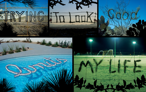
Idea # 16: METAPHORIC LETTERING
Trying to Look Good Limits My Life (2004), part of Stefan Sagmeister’s typographic project '20 Things I Have Learned in My Life So Far.' Words are formed from natural and industrial materials and composed in situ.

Idea # 83: PSYCHEDELIA
Gebrauchsgraphik (1968). The youth style influenced by drugs and rock and roll quickly became a commercial visual vocabulary. Founded in San Francisco, this German version smoothed out some of the rough edges.

Idea # 31: RED WITH BLACK
A Season in Hell (1944), a black-and-red assemblage of stark and wobbly forms characteristic of Alvin Lustig’s highly abstract visual vocabulary, is a graphic equivalent of the tormented prose of poet Arthur Rimbaud.
Heller and Vienne write in the introduction:
[Big ideas] are notions, conceptions, inventions, and inspirations — formal, pragmatic, and conceptual — that have been employed by graphic designers to enhance all genres of visual communication. These ideas have become, through synthesis and continual application, the ambient language(s) of graphic design. They constitute the technological, philosophical, forma, and aesthetic constructs of graphic design.

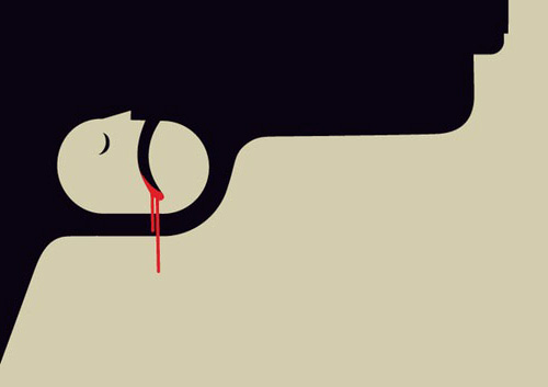
Idea # 19: VISUAL PUNS
Gun Crime (2010), illustrated by Noma Bar, is a commentary on the tragic toll of gun-related violence in the UK. The trigger serves as the mechanism and outcome of gun attacks.

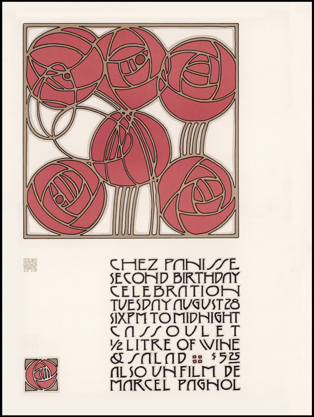
Idea # 17: PASTICHE
Chez Panisse Second Birthday Celebration (1973), a poster designed by David Lance Goines in an homage to the Jugendstil style of the Vienna Workshops and Vienna Secession movement.

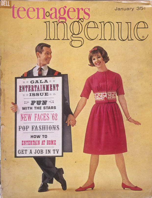
Idea # 80: TEEN MAGAZINES
Teenagers Ingenue (1962) capitalized on the developing female teenage commercial market for fashion, cosmetics, and other beauty aids. Teens were now treated as young adults.

Idea # 35: EXPRESSION OF SPEED
Rainboeing the Skies (1971), an ad introducing the new Boeing 747 to El Al Israeli Airlines by graphic designer Dan Reisinger. This iconic image is at the center of an Internet controversy, with some claiming that it was in fact an Air Canada poster.

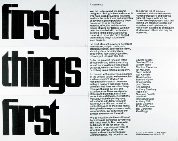
Idea # 25: MANIFESTOS
First Things First (1964), published by British designer Ken Garland, who intended to radicalize the design practice that was fast becoming a subset of advertising. In 2000 an updated version was printed in cutting-edge magazines including Adbusters, Emigré, Items, and Eye.

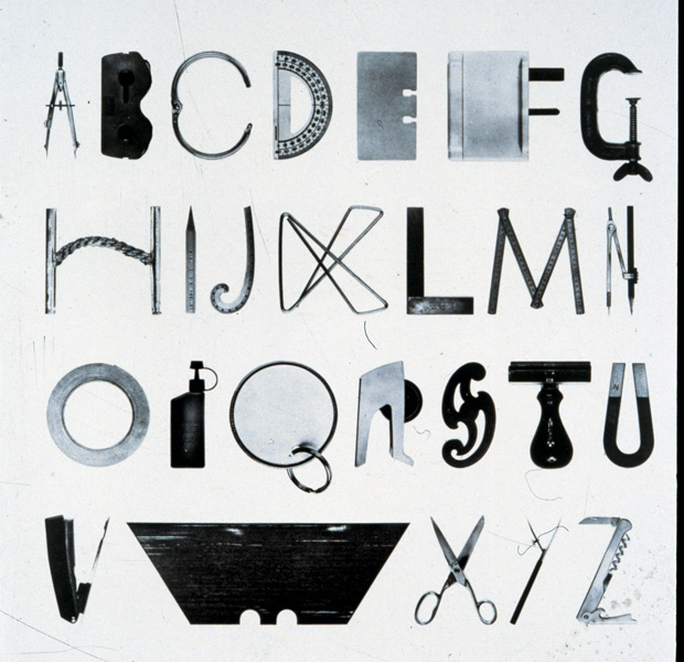
Idea # 38: FOUND TYPOGRAPHY
Alphabet with Tools (1977), by Mervyn Kurlansky, takes everyday objects found in homes and workshops and transforms them into the letters of the Western alphabet.
From how rub-on lettering democratized design by fueling the DIY movement and engaging people who knew nothing about typography to how the concept of the “teenager” was invented after World War II as a new market for advertisers, many of the ideas are mother-of-invention parables. Together, they converge into a cohesive meditation on the fundamental mechanism of graphic design — to draw a narrative with a point of view, and then construct that narrative through the design process and experience.

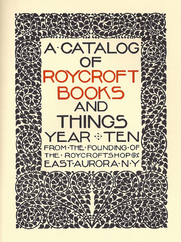
Idea # 15: ENTREPRENEURSHIP
A Catalog of Roycroft Books (1905?), designed at the Roycroft workshop in East Aurora, New York. Influenced by William Morris’s Arts and Crafts Movement, Elbert Hubbard established a crafts colony that sold books, textiles, and other products.

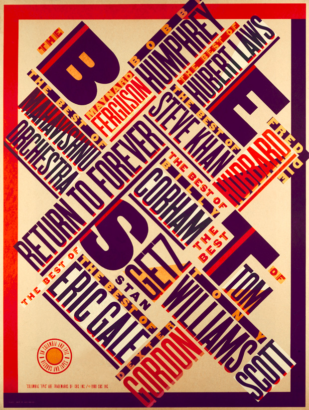
Idea # 48: TRIANGULATION
The Best of Jazz (1979), a typographical masterpiece by Paula Scher, was done when she was discovering Aleksander Rodchenko and El Lissitsky. She recalls her work being acclaimed as 'new wave' and 'postmodern' when in fact it was a private homage to the pioneers of the Russian avant garde.

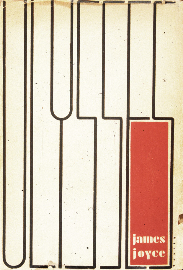
Idea # 37: DUST JACKETS
Ulysses (1934), hand-lettered and designed by Ernst Reichl, was said to be influenced by the paintings of Piet Mondrian.

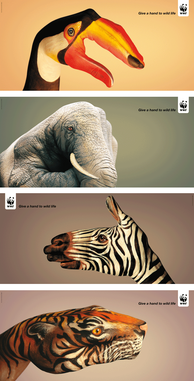
Idea # 66: PUBLIC SERVICE CAMPAIGNS
Give a Hand to Wild Life (2008), by Saatchi & Saatchi Simko agency in Geneva, is a series of clever and beautiful photographs of human hands camouflaged as wild animals by bodypainter Guido Daniele.
On the latest episode of Debbie Millman’s invariably excellent Design Matterspodcast, Heller talks about the process and rationale behind 100 Ideas that Changed Graphic Design:
History, as we all know, is written by the survivors. And there are certain historical facts that never get covered. And, in graphic design, it’s fascinating how many things don’t get covered until somebody uncovers them.
Subscribe to:
Comments (Atom)

